You must log in or # to comment.
Thats actually kinda nice, cool that they’re changing it up for the tournament. Wish they would have somehow incorporated the purple and the Dino though.
It’s definitely cleaner than some of the others. Really Nets vibes but for just a few games a year totally fine with trying new things to mix it up a bit.
well that really explains the decisions behind the CITY jersey.
edit: San Antonio looks like it belongs to the Supersonics
Atleast its not as bad a some other teams lol
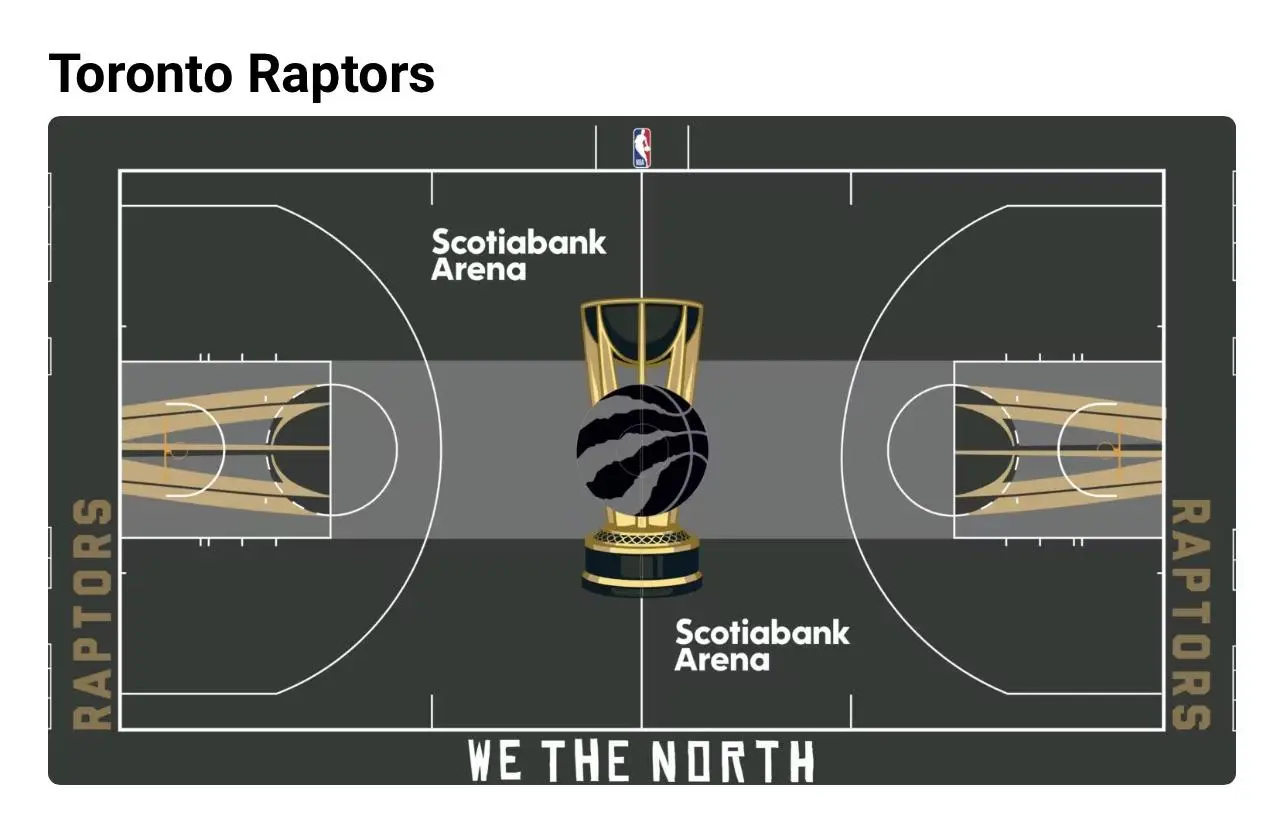
Not a fan, this looks like a high schoolers photoshop assignment. Honestly think the current court with the darker raptors tear patches looks better and far more creative.