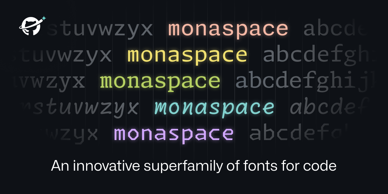
The way they talk about it makes it sound like they invented the written word, but that notwithstanding the fonts actually look really nice in my opinion.
That Krypton font do looking nice
Looks lovely! The art of fonts is something I will never understand but always appreciate. This website is also brilliant in showing everything dynamically and explaining why it all matters. Safe to say Github will start using it everywhere? It’s also open source, which is nice (and makes sense considering what Github is striving for).
Edit: Not 100% sure on texture healing though. Toggling it on and off in the example makes me feel like texture healing makes everything look weirder. It makes the font look less monospace which should be good, but it just messes with my mind when some letters look slightly different in different contexts. Like the spacing is not immediately obvious to me and having the same letters look different is throwing my mind in a loop. I guess I’ll need to try it to see if it’s comfortable.
I can’t shake this feeling that these are lacking something, like I remember looking at Fira for the first time and being like wow, even jetbrains mono had a sort of generic charm. These on the other hand, are just meh.
Maybe they are someone’s cup of tea though. I am sure in 6 months I will be hearing about how GitHub invented the developer font of some rubbish like that.
Calling it now, Radon will become the new Comic Sans.
Looks really good, but I’ll stick with my favourite M+ Code, which I use in iTerm2, Emacs, and VSCode.
https://www.programmingfonts.org/#mplus
Also in https://www.nerdfonts.com/
Edited to add: they have semiwide and wide, but no condensed? Weird. That contextual resizing is pretty cool though!
Another one? Why didn’t they contribute fixes to an existing font family? 🙄
Neon looks good. The rest are awful.
Terminus is still my favorite monospaced font followed by Roboto Mono, so ignore me.
This is pretty cool. But I’ll stick with Anonymous pro.


