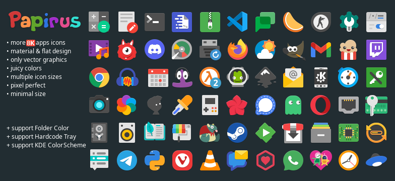
Papirus… Imo it’s the best looking icon pack out there
Omg … I forgot all about this one.
Gonna be boring and say Papirus
Papirus slaps
- Fluent (pink dark) (round)
screenshot
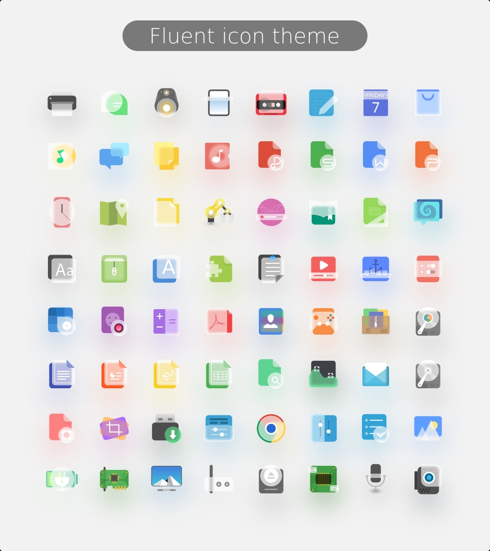
screenshot
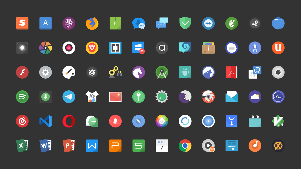
- Tela (orange dark)
screenshot
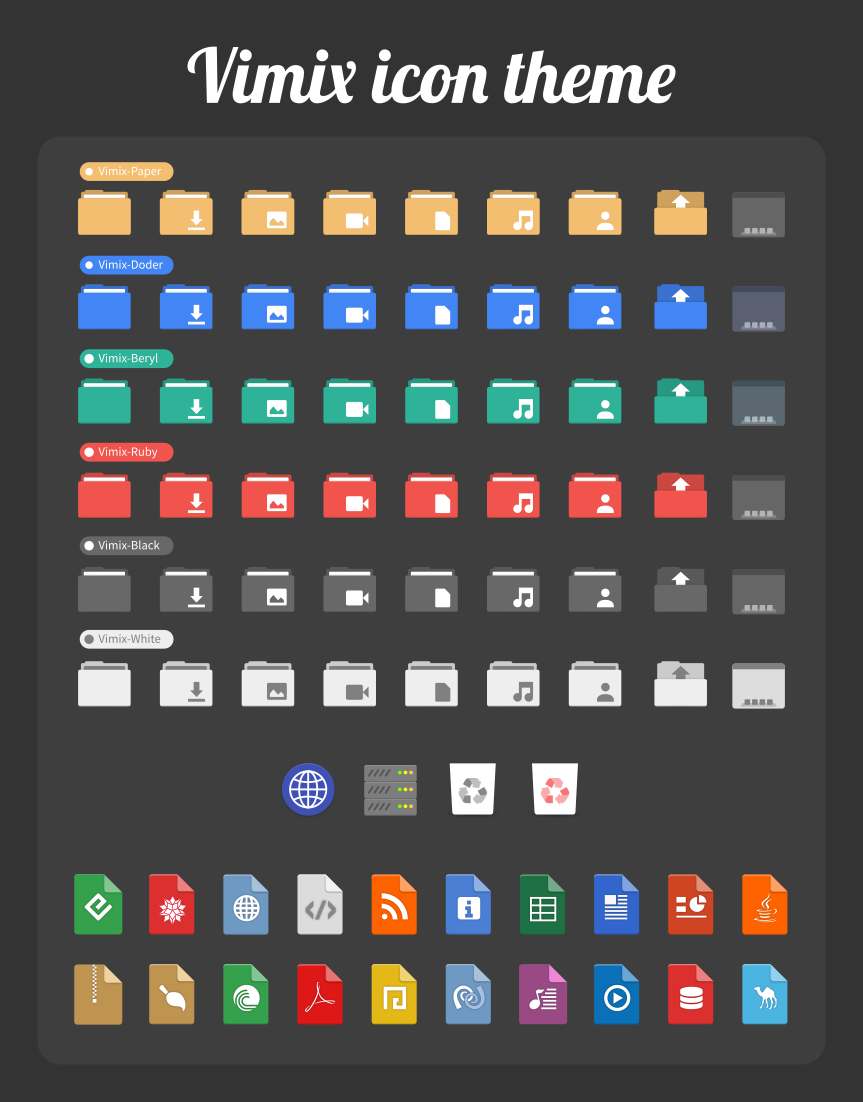
- Vimix (ruby dark)
screenshot
screenshot

screenshot
From this thread I tried out Gruvbox Plus Dark, which is nice, but a little low on contrast, and I don’t prefer such uniform shapes.
Huh, I only now notice that the Fluent, Tela, Vimix, and Qogir repos are owned by the same user…
Tokyo night https://store.kde.org/p/2053460
Yup!
Colloid dark and Nordzy
I love the Gruvbox Plus icon pack. Especially the firefox icon
Numix-Circle has been a favorite of mine as long as it has been around. Now, I mostly use Breeze because it is highly compatible, beautiful, and widely used which makes it less jarring when I use other computers.
Back in the Plasma 4 days I joked that the default oxygen theme was ugly on purpose, so users would be forced to dive into customizing their own configuration (which is where KDE Plasma really shines above the rest). I think the defaults have come a long way, and it’s nice to have a stock desktop ready-to-go without much customization.
The Sweet KDE Plasma theme is very cool! It should be the one used also by Garuda Linux.
I’m enjoying Orchis right now. Kora Icons have been my fav for a while and haven’t been replaced yet.
I’m not on KDE Plasma, but icon packs work regardless of desktop. I use Papirus with the Catppuccin folder icons patch.
Sweet
Honestly, I like Breeze. I just change the colour and it works.
I am also quite a fan of Oxygen and Mint-X; but they look out-of-place on my newer systems, and my older systems have trouble running Plasma.
Sweet candy
